The results of all the model runs can be analysed by clicking the '6) Process Results' button. This will read the peak flow results for all reporting subcatchments for all AEPs, temporal patterns and durations and calculate statistics.
Tabular Results Display
The results reported can be tailored by the settings in the Configure Results panel.

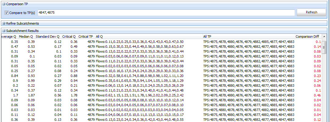
For the events, durations and subcatchments selected, the Subcatchment Results table will report:
•The average, median, standard deviation and adopted TP (based on the settings) peak flow for the ensemble
•The adopted TP name
•The ARF error. That is, if the total contributing area draining to the selected subcatchment is significantly less than the area of the catchment, then a different ARF may be necessary to correctly assign flows for this subcatchment. This field reports the difference between the ARF for the whole project (based on the area field in the Areal Reduction Factors panel) versus the total contributing area for the subcatchment. This can be viewed as a tool tip by hovering the cursor over the cell. However, it does not report the difference in flows resulting from the different ARFs and a Partial Area Check may be necessary to quantify this.
•The median volume and the volume of the adopted TP (ML)
•The median time to peak and time to peak of the adopted TP (hrs)
•Peak flows for each ensemble member in ascending order
•The TP names corresponding to each peak flow in the prior column
Please note for RAFTS, the flows reported in the table will be the subcatchment peak flow or the peak basin outflow if a basin exists. However, the hydrographs are always the subcatchment outflow. As such, the peak flows in the table may not match the hydrograph peak in the chart for subcatchments with a basin. If you require basin outflow hydrographs, insert a 'dummy' subcatchment downstream.

Subcatchment Results
From Storm Injector 1.3.6 onwards, results for storages / basins in the model will be reported in the Storage Results panel. This panel reports the adopted temporal panel (based on the settings) and ensemble metrics including average median and standard deviation. The entire table can be configured to report on Inflow, Outflow, Stage or Volume based on the Storage Metric selected in the top right corner.

Storage Results
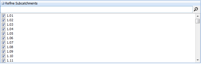
Configuring the Subcatchments of Interest
The Refine Subcatchments panel allows the user to select the subcatchments of interest for display of results (in the ALL configuration) and the calculation of statistics. For example, a user may wish to only select the subcatchments that are within a hydraulic model area of interest. This will mean that the temporal pattern analysis (refer below) will be tailored to those subcatchments most of interest to the user.
Individual subcatchments can be un-selected by clicking the corresponding checkbox. The search filter can be used to quickly find subcatchments in a large model. The right click menu offers features including check all, clear all and invert selection.
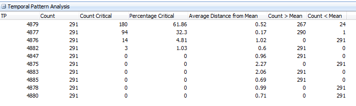
Temporal Pattern Analysis
The Temporal Pattern Analysis panel attempts to analyse the results for the current results displayed in the Subcatchment Results panel (which is in turn based on the Subcatchments of Interest and Configure Results panel). It lists the following statistics:
•how many rows in the table include a specific TP,
•for how many rows was this TP the adopted TP
•for what percentage of rows was this TP the adopted TP
•what is the average absolute difference between this TP and the mean of all TPs for each row. For example, if you have 4 subcatchments selected in the Refine Subcatchments panel, it will determine the absolute difference between the mean of the peaks and the TP in question for each of the 4 subcatchments and then average them. Thus, the TP with the lowest ‘Average Distance from Mean’ may be the most representative TP to use if you had to select one to represent the adopted TP for the subcatchments.
•For how many rows was this TP greater than the mean of all TPs
•For how many rows was this TP less than the mean of all TPs
These statistics may help a user decide which TPs require modelling is a subsequent hydraulic model.
Comparison TPs
The Comparison TPs tool is useful if a user wishes to view differences for subcatchments between a designated TP(s) and the adopted TP. One or more TPs (comma separated) can be added to the text file and the 'Compare to TP(s)' checkbox selected. This will cause a new column to be added to the Subcatchmentt Results grid listing the minimum deviation between flow from the adopted TP and the flow from the nearest of the comparison TP(s). This allows the user to quickly identify if a particular subcatchment may not be well represented by the comparison TPs. The TPs in the Temporal Pattern Analysis grid can easily be added to the Comparison TPs field by right click.
Box and Whisker Charts
Results can also be visualised as box and whisker plots using the 'Box Charts' button. The box charts will display the median (horizontal line), average (star) and first and third quartiles (top and bottom of box). The ends of the whiskers represent the lowest and highest points that are still within 1.5 inter-quartile range (equal to the size of the box). Points that are outside the whiskers shall be plotted as outliers.
Various metrics can be charted based on the Metric setting.
For subcatchment flow results these include:
•Peak Flow (m3/s)
The peak flow as reported by the model.
•Volume (ML)
The volume of runoff as reported by the model.
•Time to Peak (hrs)
The time to peak as reported by the model.
•Peak Volume over X mins (ML)
The peak volume over a user nominated time increment as calculated by analysis of the hydrograph. This is designed to a quasi-hydraulic measure for subcatchments that are volume dependent.
•Volume over Flow (ML)
The volume over a user nominated flow as calculated by analysis of the hydrograph. This is designed to be a quasi-hydraulic measure for volume in excess of a stream capacity.
•Time until Flow (hrs)
The time until a user nominated flow is reached as calculated by analysis of the hydrograph. This is designed to inform the minimum time available before critical flows (such as bridge overtopping) are reached. It should be noted that the critical duration for flows corresponding to key evacuation criteria may be lower than critical durations based on peak flow analysis. Please exercise caution in the case that a user nominated flow is not reached, a time of zero will be returned.
•Time over Flow (hrs)
The total time that flow exceeds a user defined threshold as calculated by analysis of the hydrograph. This can be used to help inform estimates of the duration that evacuation routes may be cut.
For storage results these include:
•Peak Inflow (m3/s)
The peak inflow to the storage as reported by the model.
•Peak Outflow (m3/s)
The peak outflow from the storage as reported by the model.
•Peak Stage (m)
The peak stage at the storage as reported by the model.
•Peak Volume (ML)
The peak volume stored in the storage as reported by the model.
•Time to Peak Stage (hrs)
The time until the peak stage as calculated by analysis of the hydrograph.
•Time to Peak Inflow (hrs)
The time until the peak inflow as calculated by analysis of the hydrograph.
•Time to Peak Outflow (hrs)
The time until the peak outflow as calculated by analysis of the hydrograph.
The adopted temporal pattern is always based on the peak flow criteria from the Settings. The flow (or volume or time to peak) corresponding to the adopted temporal pattern are linked by a line chart and labelled with their temporal pattern code and value for the selected metric.
Compare Durations Chart
The Compare Durations chart displays box and whisker charts for the selected durations with equal spacing on the X axis in ascending order. The critical duration (based on highest mean peak flow in the ensemble) is highlighted in yellow.
FFA data from the FFA Data panel can also be shown on the Compare Durations chart. This will be a light blue horizontal band showing the relevant upper and lower bounds of the FFA data for this AEP. This will require a row in the FFA data that has a matching AEP to that displayed in the (1 in X) Year AEP box and non-zero upper and lower bound values. It will also require the 'Include FFA' option in the Chart Options to be selected.

Compare Durations Chart
Compare Events Chart
Multiple events can be compared using the Compare Events panel. These can be compared in two ways:
•A user defined order on the X axis
•With a Log scale of AEP (1 in X) years
The first of these options prepares each event with equal spacing on the X axis as shown below. You can convert the Y Axis to a Log scale in the Chart Options panel. The events can be re-ordered manually by dragging rows or sorting via the AEP or Event columns.

Compare Events (in series)
The second option can be selected by checking the 'Plot X as Log AEP (1 in X) years' option. This will display the events with the X axis position based on the Log of their AEP. Storm Injector will try to determine the AEP of events in the 'AEP (1 in X years)' column. However, if an AEP in this column is unknown or incorrect, it can be manually adjusted for charting purposes. The Y axis can also be set to a Log scale in the Chart Options panel.
Flood Frequency Analysis data can also be displayed in this chart. It can be imported (from Flike or CSV) by right click in the FFA Data panel. It can then be included in the chart using the 'Include FFA' option in the Chart Options panel. At this points, events, their labels and confidence limits (where available) can be controlled by the Legend check boxes and Chart and Label options panels. This chart can then be used to verify how well (or not) the design events fit with a FFA analysis as shown in the example below.

Compare Events (log AEP scale with FFA)
Hydrograph Charts
The hydrograph for any AEP, subcatchment, duration can also be plotted using the 'Hydrograph Charts' button. The hydrograph associated with the adopted temporal pattern will be displayed as a thicker line with a '(Critical)' suffix in the legend. Rainfall hyetographs can also be displayed using the 'Chart Rainfall' checkbox. The colours of the series can be edited using the Edit button. Labeling of peaks and rainfall values can be tailored via the Options panel.
For XP-RAFTS and WBNM, local hydrographs can be charted by clicking the 'Chart local hydrographs instead' checkbox. For XP-RAFTS, this requires *.loc files to be have been generated by your model. The Adopted TP displayed will still reflect the analysis of the total hydrographs peaks. For WBNM, the local hydrographs are the sum of the Qper and Qimp hydrographs and do not reflect any local storage basins.

Hydrograph and Rainfall Chart
Multiple events can be compared using the Compare Events panel.

Compare Hydrographs (critical durations)
For storages, hydrographs can be plotted for storage inflow, outflow and stage where available (not RAFTS). There is also an option to chart inflow and outflow in the same series to help visualise attenuation.

Combine Inflow and Outflow Storage Charting
Peak Volume Over a Given Time Period
Storm Injector also provides for the charting of peak volume over a user defined time period in an effort to give insight into the selection of critical storms for volume sensitive catchments.This feature is available in both Box and Whisker charts and hydrograph charts.

Peak Volume Chart

Peak Volume Hydrograph Chart
Spatial Charting (Beta)
From version 1.2.7, Storm Injector includes a feature to undertake spatial thematic mapping of results. This can automatically be done via a node link arrangement (based on the coordinates of the subarea nodes) or using a subarea shapefile. When using a shapefile, an attribute field must be selected that matches the result output labels. At this stage, Storm Injector will not convert shapefile coordinates to/from lat long, so please ensure the shapefile coordinate system matches the coordinate system of the model and select Project Coordinates or Lat/Long accordingly.
Subareas that can not be matched to results or are not selected in the Refine Subcatchments results filter will be shown in grey and can be hidden from the display using the 'Hide Grey Subareas' checkbox. The 'Reset Zoom' checkbox determines if the map will be zoomed out and aspect ratio fixed at 1:1 on clicking the Add/Update button. If you would like to chart different results while being zoomed in, uncheck this option. The map can be zoomed by clicknig and draging on the map. Individual layers in the map can be turned on/off and reordered in the Layers panel and further options including line widths and labelling are available by right click. Additional shapefile layers can be added to the display for visual purposes such as streams using the Add Layer button.
You can configure the results you wish to map spatially in the Value to Map panel and update the map by clicking Chart.

Node Link Mapping

Shapefile Mapping